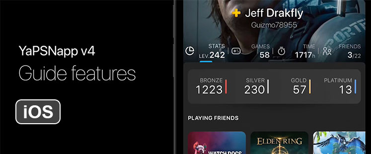
It’s been a long time since I communicated on the iOS v4 progress. The redesign takes time, especially because depending on the week, I can’t always devote the necessary time to it, but I’m quite proud of what I’ve finished on the new trophy guides features.
The next version will be very oriented to trophy hunters and that’s why the trophy guide part has been greatly improved, it was a lot of work, a real app in an app … I’ll let you watch and give me your impressions and ideas in comments.
(You can watch the video in landscape mode with the explanations, but if you’re on mobile and you can’t see the app correctly, switch the video to 720p (360p by default) and “double tap” on the video, to focus the action)
And other features ?
I have still a lot of work on this version, at this stage, the missing features / screen are:
- Connected profiles detailed statistics (Main screen and tabs are implemented, but not yet the sub-screens)
- Messages / Notification Tab (and all associated screens)
- Advisor tab (and all associated screens)
- Games database tab (and all associated screens)
- THE iPAD VERSION :'(
Don’t ask for a release date
At this stage, I have no idea when this version will be released, but I expect to communicate more often on it. When an iso functional version (all features of v3) will be ready I will post a blog ticket for alpha / beta testers recruitment.


This looks fantastic!
This is amazing, Thank you for your hard work on this new version. I’m excited to see it. Good Luck.
You’re the best!!!
Looking good, you have been hard at work. Thank you for all you time on this, can’t wait to see it in action.
AWESOMENESS!
I thing that’s looking perfect and it’s an overall great remake of this app
The color scheme is vibrant with great contrast between the dark theme and some items like rarity of trophies and icon of hours played, those colors where very well picked
One thing that I would like to see added if you could of course is the Helvetica Neue font since is the standard font between Apple devices.
On the 2 person comparator I do t understand why you have the trophy rarity icon
Still on the same screen if your just comparing trophies then I don’t quite get why you do have a search guide icon. I guess yeah it’s for easier access but yeah
Overall:
Terrific job
Well done
I wish you keep improving and I can’t wait to try it out
Keep on the amazing work
Nice work. Congrats!
Looks amazing, cannot wait! It might be worth after release – advertising to the psnprofiles.com community through their forum.
Thanks for your great work!
meh as fuck
Hello
thank you
I am very excited to try this out
do you know approximately when v4 will be available?
looking forward to it
Nice information about ios app development thanks for sharing this article.
This all looks amazing! I wish you well and think this app would hit the top of the charts.
The Best App for Trophies!! Keep up the hard work!! Hope to see the new version soon enough!
Still have the old version installed and have been waiting on this update for a while. I’ve been away from home for a while and thus been away from my PS4 for a while and I can’t imagine myself not using this app when I eventually get back to trophy hunting. I realize software development takes time, but given the amount of radio silence since this blog post I can only assume it’s been development hell or that you’ve abandoned the project – either way your work has been greatly appreciated by many, and I do hope that either the other websites I use suddenly decide to develop a mobile client or that the update for this app arrives soon. Thank you for your work :)
Heyy, it’s been more than a year! Any news?
Facts wondering the same… hoping both ios and android get this update